Creating effective charts and visualizations is essential for turning data into actionable insights. At the University of Missouri, we emphasize the importance of using visual tools that clearly and accurately represent data, making complex information understandable and accessible to a wide audience.
This page provides best practices for selecting the right chart types, designing clear visuals, and ensuring your visualizations are both informative and engaging. By following these guidelines, you can enhance the impact of your data presentations, facilitating better decision-making and communication across the university.
Whether you’re developing a simple bar chart or a comprehensive dashboard, these best practices will help you create visuals that are not only visually appealing but ensure the correct message will be received by the end user.
Detailed Chart/Visualization Best Practices
When to use a bar/column chart:
- Compare values across different subgroups
- Understand relationships between categorical variables
- Grouped or stacked bars can break one numerical variable into different subgroups
- 100% stacked charts can be used to show distribution of subgroups within the whole for each variable along the axis
When bar/column charts are not appropriate:
- To compare items that require different scales
- When it feels cluttered
Best practices:
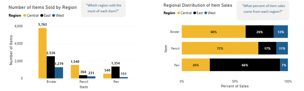
- Numerical axis (usually the y axis) must start at zero. Human eyes are sensitive to area, and incorrect conclusions may be drawn when bars are shortened.
- Use a horizontal bar chart if the category names are long.
- Put value labels on bars to preserve clean lines of the bar lengths.
- 100% stacked bar charts should not have more than two (maybe three) series.
- If there is not a lot of variation between data points, chart is boring, or reference material is being used, sometimes a simple table is a better alternative
When to use a line chart:
- Show trends and progress over time with discrete or continuous data.
- Highlight changes in values or slopes of a variable.
- Multiple lines can show multiple variables on the same scale.
- Multiple lines can also show the same variable for multiple observations (i.e., multiple years, student types, etc.).
When line charts are not appropriate:
- Displaying quantities of things.
- Working with categorical data.
- Making part-to-whole comparisons.
Best practices
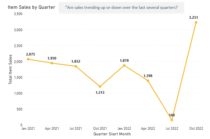
- The x axis should start at zero (or the lowest point). Especially if comparing trends across several categories.
- The y axis should usually start at zero. Zoom in only if it’s really necessary. If multiple line charts are on the same page (or same report) they should have the same scale. If not, that should be called out for the end-user.
- Do not display gridlines behind the lines. Showing only one vertical or horizontal line can be ok, but less is more.
- Use 5 or 6 lines maximum. Visualize only what your story needs, no more, no less.
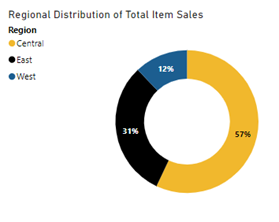
When to use a donut chart:
- Show the relative relationship between 2-3 categories from one variable.
- Categories represent parts of a whole and add up to 100%. This may result in the inclusion of an “other” or “none” category.
When donut charts are not appropriate:
- Data has negative numbers.
- More than one variable needs to be compared.
- There are more than 6 categories, 3 are optimal.
- Data is ordinal, a scale, or an interval (i.e., survey responses from “Strongly Disagree” to “Strongly Agree” or displaying age ranges).
Best practices:
- Always use a donut instead of a pie. This helps the eye see the size variations. Consider if segments are easier to see with other visualizations (i.e., bar, stacked bar).
- Do not overly format a pie or donut chart. Do not use exploded, 3D effects, or other embellishments.
- Ensure labels are easy to read and understand.
- Multi-layer donut charts should be used very sparingly. They are difficult to pre-attentively process and for the user to understand quickly.
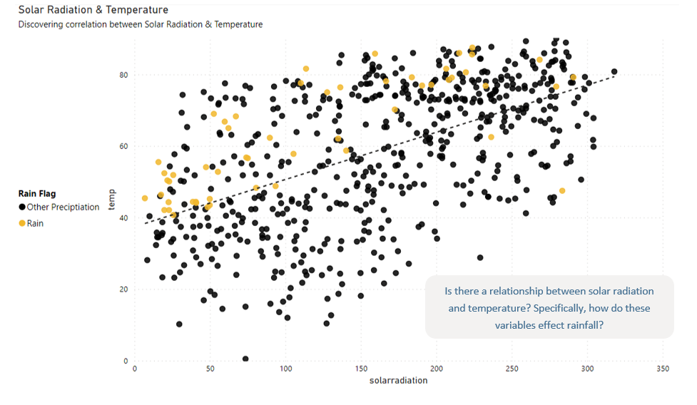
When to use a scatter plot:
- Displays the relationship between two discrete or continuous variables (discrete scatter plots are often called discrete graphs, but function nearly identically).
- Identify correlational relationships and data patterns.
When scatter plots are not appropriate:
- Data on both axes are not discrete or continuous.
- More than two variables need to be analyzed.
- There are too many data points to plot, and they overlap.
- The goal is to determine causation, correlation does not show causation.
Best practices
- Change the color or symbol to show groups with categorical variables.
- It can be nice to display the trendline and/or regression equation.
- Be careful in describing correlations between variables. Scatterplots are meant for data discovery, and statistical analysis is needed to determine root causes/causation.
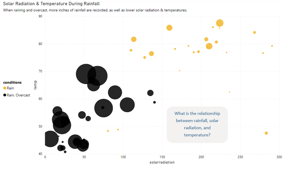
When to use a bubble chart:
- Nearly identical to scatter plots, with the addition of a third continuous or discrete variable displayed by the size of the bubble.
- Identify correlational relationships and data patterns.
- Precise comparisons are not necessary, and users are looking for patterns in the data.
When bubble charts are not appropriate:
- When comparing variables that are not discrete or continuous or more than three variables need to be analyzed.
- There are too many data points to plot, and they overlap.
- Precise numbers are required by the end user.
Best practices
- Change the color or symbol to show groups with categorical variables.
- It can be nice to display the trendline and/or regression equation.
- Be careful in describing correlations between variables. Bubble charts are meant for data discovery, and statistical analysis is needed to determine root causes/causation.
When to use a heatmap:
- Show relationships between two variables for one value.
- Comparison variables must be categorical while the value in the cell must be quantitative.
When heatmaps are not appropriate:
- There are too many categories and the visual is overcrowded.
- More than two variables need to be analyzed.
- There are too many data points to plot, and they overlap.
- The goal is to determine causation, correlation does not show causation.
Best practices:
- Choose a suitable color palette. Use a sequential palette (lighter to darker shades of the same color) to display density where lighter is less dense and darker is denser. Use a diverging palette (a pair of gradations of color that meet in the middle) when you have a meaningful middle point or extremes should be emphasized.
- Always include a legend for how the colors map to numeric values.
- Where possible, include the value in the cell. It is duplicative but helpful.
- Sort axes to tell the story. If natural sorting of the categorical variables is not obvious, consider sorting by the largest cell value to the smallest.
- Be careful in describing correlations between variables. Heatmaps are meant for data discovery, and statistical analysis is needed to determine root causes/causation.
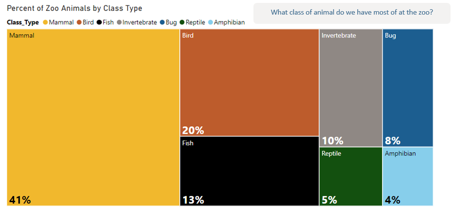
When to use a treemap:
- Visualize a part-to-whole relationship among many categories where precise comparisons are not important.
- Efficient use of space is important.
- Data is hierarchical.
When treemaps are not appropriate:
- Precise comparisons are needed.
- There are categories with values less than or equal to zero.
- Nuanced questions are anticipated.
Best practices:
- Treemaps are meant to give general conclusions and are helpful in the exploratory phase of analysis.
- Consider the questions an end-user may ask. If they are more nuanced, consider another chart type that would serve the data better. If one variable is categorical and one is quantitative, use a bar chart. If both variables are quantitative, use a scatter plot.
- If the visual requires too much explanation for the regular end-user, consider another visualization.
- Use color and borders conservatively to avoid cluttering the view.
Tips for Using Geographical Data in a Map
To map or not to map? Everyone loves a good map. They are exciting and colorful, and anytime geographical data is included in a data set, analysts often wonder, “How can I include a map?” However, just because geographical data is included in the data set, does not mean a map is the best visual for the story. Maps, like all visualizations, are designed for a purpose. They tell specific stories, but not all of them. There are also several different types of maps (points/bubbles, choropleth, heat maps, or routes). The main rule of thumb: fully understand the data story either the analyst or end-user is trying to find. Then evaluate whether a map does that job best.
Keep in mind:
- Only use a map if the primary component of the data/data story is geographical.
- Just because data can be mapped, does not mean it should be mapped. Before creating a map, confirm the location matters to the story.
- Sometimes, another type of chart is a better representation of geographical data.
- For example, differences can be shown between geographic areas in a bar/column chart, the rise and fall of different rates over time can be displayed with a line chart, and two variables for each area can be compared in a scatter plot.
- Latitude and longitude are the most accurate way to map a location. Partial or inexact geographical information may result in problems like “Cambridge” showing up in Cambridge, MA instead of Cambridge, England.
- Smaller geographies (like county, city, or zip code) display more granular patterns. Larger geographies (like state or country) that display aggregated data could hide what’s happening at lower levels.
- Always include a legend, so that end users can map the value to color and/or size.
- Generally, maps are best used when exploring patterns in the data, not for precise comparison.
Detailed Map Best Practices
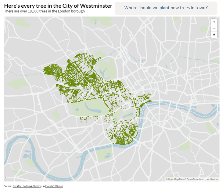
When to use a point or bubble map:
- Each row in your data set has a specific location like a high school or transfer institution.
- Users will want to look at data points near the points, like average high school GPA or percent of incoming FTC that are test optional.
When point or bubble maps are not appropriate:
- Data refers to large areas like states or countries.
- The story is not about the visible distribution or clustering of the points, but about comparison or composition.
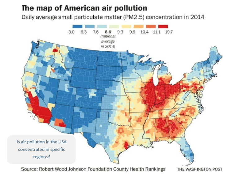
When to use a choropleth map:
- Each row in your data set has a specific location like a high school or transfer institution.
- Data is standardized to show a rate or ratio. This is to avoid showing simple population density.
- Measurable values occur everywhere within the area of study, and not just at specific locations.
Choropleth map limitations:
- When using choropleth maps for simple distribution, they can be misleading as this does not control for population density or other factors. For example, a choropleth map displaying the number of incoming FTC students may simply be showing the areas with the highest population density.
- These maps can also create artificial boundaries where there are none. For example, looking at rainfall by county level may give the impression that just over the county line, there is significantly more or less rain.
- Choropleth maps can be difficult to decipher for people with sight differences.