Data Storytelling
When crafting reports and visualizations, it is important to continue to tell the data story. Keep in mind the scope of the specific project and fully understand the story you are trying to share. If a data point is interesting, but out of scope of the project, save it for a future analysis where it is in scope. If a visualization or data point does not help tell the story, remove it from the report. If the standard end user cannot derive the desired information from a visual, consider how it might be changed to ensure the correct message is received. Ensure the visuals can stand on their own. You may not always be available to explain the context surrounding what you’ve created. Make sure a user will understand the full story if they are reviewing at their desk, alone.
Encourage & Accept Feedback
It is always a clever idea to collaborate with others (both data savvy and data beginner) to ensure the data story is being received correctly. Feedback, revisions, and multiple iterations are the best way to ensure visuals are the most useful and impactful they can be. Visualization creators work best when they don’t work alone.
Define: Pre-Attentive Processing
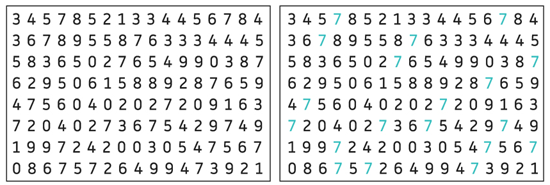
The human brain processes information quicker when visualized, or in the form of a chart/graph. Pre-attentive processing refers to how the body automatically processes sensory information before the conscious mind begins to focus on any particular objects in its surroundings. This processing is extremely fast; it takes less than 500 milliseconds. Pre-attentive properties in visualizations are immediately recognized by the viewer and make visualizations easier to understand. The visuals below are common to display how pre-attentive processing works. In the visual on the left, try to count the number 7s, then try again on the right. The visual on the right makes counting far easier because the use of color allows for pre-attentive processing and makes the recognition of the number 7s almost instant.
The four pre-attentive visual properties used to create visuals are: color (intensity/hue), form (orientation/shape), spatial positioning (2D position), movement.
Someone creating visualizations should understand pre-attentive processing and ensure visuals created are understood quickly. Further, the information that is gathered while pre-attentive processing is occurring should be the information relevant to the data story. Visuals that require too much explanation, annotation, or point to incorrect conclusions should be edited or removed.
Use Pre-Attentive Processing: Color Associations
Be careful when using colors that are commonly coded to represent a certain thing. For example, when green and red are shown together, green is typically shown as “good” and red is typically shown as “bad.” Pre-attentive processing occurs when seeing these colors together, if the colors are shown in a different context, the visual may be sending an unintended message.
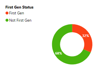
The visual to the right is a good example of this effect. The unintended message an end user may receive is that being a first-generation college student is somehow negative, while not being first- generation is more positive.
Other associations exist in different contexts. It is important to review all visualizations to ensure the correct message is being received.
Use Pre-Attentive Processing: Color, Shape, Style Consistency
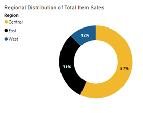
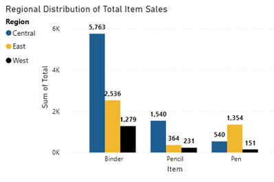
It is important for understanding that methods used to identify objects are used consistently throughout the report. For example, imagine the two visuals below are in a sales report the company President. If the President is trying to quickly identify sales statistics for the central region, she could easily make a mistake because of the color changes from chart to chart and it takes too much thought to see the difference. On the donut chart, the central region is identified as yellow, but on the bar chart the central region is identified as blue.