Effective data visualization is crucial for conveying complex information in a clear, accessible, and impactful way. In MU Analytics, we adhere to a set of Data Visualization Style Guidelines to ensure consistency, clarity, and professionalism across all our reports and dashboards. These guidelines are designed to help you create visualizations that not only look cohesive but also communicate data effectively to diverse audiences.
Our style guidelines cover a range of best practices, including the use of colors, chart types, and accessibility standards. Whether you’re building a simple report or a complex dashboard, following these guidelines will help you maintain visual integrity and enhance the user experience.
By aligning with these standards, you contribute to a unified visual identity that strengthens the credibility and usability of data analytics across the university. For more information about visual standards at Mizzou, check out the Brand & Identity website.
Guidelines
- The only acceptable text/data label colors on top of data visualizations are black (#000000) and white (#FFFFFF).
- When creating visualizations across pages/slides color consistency is important (i.e. counts = gold and averages = black).
- Tints of our secondary colors are useful when designing charts, graphs and diagrams.
Visualization Support

Viz/Charts Best Practices

Data Storytelling

MU PBI Wireframes & Themes
Primary Color Palette
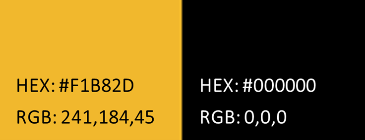
The primary colors for data visualizations at Mizzou are black and gold. These should always be the dominant colors.
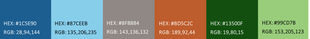
Secondary Colors
Secondary colors are useful when more colors are needed for data visualizations. Color should be used sparingly and always with a purpose. For information about accessibility please review the color accessibility section below.
Background Colors
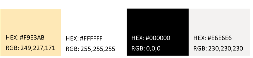
Listed below are the acceptable background colors for data visualizations. Using these in combinations guarantees accessibility. Text should match the colors in each square (black: #000000 or white: #FFFFFF). Using gold text is not advisable as it can be difficult to read. The visualization/report backgrounds should be white with the other colors used as occasional backgrounds in text boxes.
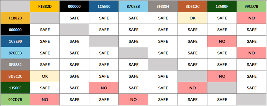
Color Accessibility
The first 6 colors (#F1B82d, #000000, #1C5E90, #87CEEB, #8F8884, #BD5C2C) are safe to use in any combination for the three main types of color-blindness (protanopia, deuteranopia, and tritanopia). For more information about accessible color combinations, see the matrix below
Color Theory for Data Visualization
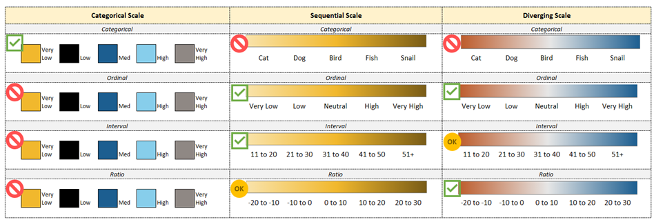
Categorical

Categorical color palettes are used to distinguish non-numeric data into visualization. These colors are designed to be distinct from each other as they are representative of different categorical variables. Above is an example of a color safe categorical palette with approved colors (#F1B82D, #000000, #1C5E90, #87CEEB, #8F8884).
Sequential

Sequential color palettes are a gradation of colors from light to dark and have numeric meaning. Above is an example with the Mizzou Gold (#F9E38B, #F4C657, #F1B82D, #B58A22, #795C17).
Diverging

Diverging color palettes are a pair of two gradations that meet in the middle. Using blue and orange at the endpoints is safest for those with sight differences (#1C5E90, #8DAAC0, #E1E3E4, #C98564, #BD5C2C).
Examples of Use